Walk into almost any talent acquisition team's monthly review meeting and you will see the same thing projected on the screen: a dense grid of metrics, often fifteen to twenty rows deep, displayed in a spreadsheet or a generic BI tool, with every metric presented at the same visual weight and no clear indication of which numbers matter most. The recruiting leader clicks through tabs, the team nods at the numbers, and everyone moves on to operational updates. The dashboard served its ceremonial function of confirming that metrics were tracked, but it did not serve its strategic function of driving a single decision. This scene plays out in organizations of every size and industry, and it reflects a universal problem: recruiting dashboards are almost always designed for the person who built them rather than the person who needs to use them. The builder wants comprehensiveness. The user needs clarity. The result is a dashboard that answers every question poorly rather than answering the most important questions well.
Why Most Recruiting Dashboards Fail to Drive Decisions
The most common dashboard failure is the inclusion of too many metrics, which produces a paradox of information abundance where the user has more data than they can process but less insight than they need. Research on information design consistently shows that cognitive overload sets in when a dashboard presents more than twelve to fifteen primary data points, because the human brain cannot simultaneously evaluate more than a handful of numbers and draw meaningful relationships between them. Yet the typical recruiting dashboard presents twenty to thirty metrics, many of which are variations on the same underlying data expressed in different ways. A dashboard that shows time to fill, time to fill by department, time to fill by role family, and time to fill by month is presenting four views of the same metric when one view with a segmentation control would serve the same purpose with less cognitive burden. According to Gartner, recruiting dashboards that present more than fifteen primary metrics are thirty percent less likely to drive process changes than dashboards with twelve or fewer, because the information overload causes users to focus on the metrics they already understand rather than the metrics that would reveal the most actionable insights.
The second failure mode is the dominance of lagging indicators. Most recruiting dashboards are populated almost entirely with metrics that describe what has already happened: hires made last month, offers extended, interviews conducted, applications received. These metrics are useful for compliance reporting and workforce planning, but they do not help a talent leader make a better decision today. The metrics that drive decisions are leading indicators that predict future outcomes: the quality of the current candidate pipeline, the predicted time to fill for open requisitions, the expected offer acceptance rate for candidates in final stage, and the health of the talent pool for future hiring needs. A dashboard that shows only lagging indicators is a rearview mirror that tells the driver where they have been but provides no information about what is ahead. According to McKinsey, talent acquisition teams that build their dashboards around leading indicators make twenty-five to thirty-five percent faster course corrections when market conditions change, because they can see the change in their pipeline and trajectory data before it appears in their hiring outcome data.
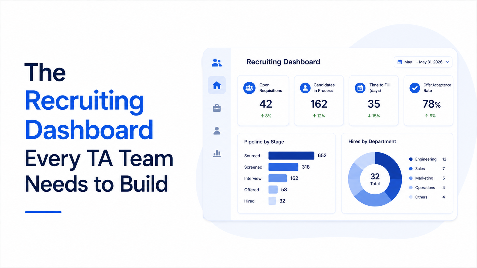
The third failure mode is the absence of visual hierarchy. When every metric on a dashboard is presented at the same size, color, and position, the dashboard implicitly communicates that every metric is equally important, which is never true. The metrics that should dominate a recruiting dashboard are the three to five that most directly indicate whether the talent acquisition function is achieving its strategic objectives. All other metrics should be accessible but visually subordinate, available through drill-down views or secondary panels. Our analysis of more tools same hiring problems found that the most effective recruiting dashboards use a three-tier visual hierarchy: a primary tier of three to five headline metrics that fill the top third of the dashboard, a secondary tier of five to seven supporting metrics that provide context and explanation, and a tertiary tier of detailed metrics accessible through interactive exploration. This hierarchy ensures that the most important information is immediately visible while preserving access to the detailed data that supports deeper analysis.
The Five Metric Categories Every TA Dashboard Must Include
An effective recruiting dashboard should be organized around five metric categories that collectively capture the full scope of talent acquisition performance. The first category is quality, which includes the quality-of-hire composite score, first-year retention rate, hiring manager satisfaction index, and ninety-day new hire performance score. Quality is the most strategically important category because it measures the output of the hiring process rather than the process itself. According to LinkedIn, talent leaders who prioritize quality metrics on their dashboards are forty percent more likely to receive increased recruiting budgets, because quality metrics demonstrate the business impact of hiring decisions in a way that process metrics cannot. The quality section should display the composite score as the primary metric, with the component scores available as supporting detail, and should include a trend line showing whether quality is improving, stable, or declining over the trailing six to twelve months.
The second category is pipeline health, which includes the pipeline health index, talent pool growth rate, pipeline diversity distribution, and candidate engagement score. Pipeline metrics are leading indicators that predict the organization's future ability to fill roles, making them essential for proactive talent planning. A declining pipeline health index signals that future hiring will become more difficult, while a growing talent pool signals increasing future capacity. According to SHRM, organizations that include pipeline health metrics on their primary dashboard are thirty-five percent more likely to anticipate and prepare for hiring surges, because the pipeline data provides early warning of capacity constraints before those constraints manifest as unfilled requisitions.
The third category is speed and efficiency, which includes time to qualified candidate, time to hire, interview-to-offer conversion rate, and sourcing efficiency ratio. Speed metrics have historically dominated recruiting dashboards, and they remain important, but they should be positioned as a supporting category rather than the primary focus. The speed section should include both the absolute metric values and the trend direction, because a declining time to hire is only positive if it is accompanied by stable or improving quality. The fourth category is financial performance, which includes recruitment ROI, cost per quality hire, and talent acquisition cost as a percentage of revenue. Financial metrics connect recruiting activity to business outcomes and provide the basis for budget justification and investment decisions. The fifth category is candidate experience, which includes candidate engagement score, application completion rate, and candidate net promoter score. Experience metrics predict future sourcing efficiency, because a strong candidate experience generates organic candidate flow that reduces future sourcing costs.
How to Structure Your Dashboard for Leading Indicators
The structural principle that separates decision-driving dashboards from reporting dashboards is the placement of leading indicators in the dominant visual position. Leading indicators are metrics that predict future hiring outcomes based on current pipeline and process data. The most important leading indicators for a recruiting dashboard are the pipeline health index, the average candidate match score for active requisitions, the predicted time to fill for the open requisition portfolio, and the expected offer acceptance rate for candidates in the final evaluation stage. These metrics describe the future trajectory of the hiring function, and they are the metrics that a talent leader should see first when they open the dashboard. According to Deloitte, dashboards that position leading indicators in the primary visual tier drive forty to fifty percent more proactive process interventions than dashboards that lead with lagging outcome metrics, because the leading indicators make future problems visible while there is still time to address them.
The leading indicator framework requires a supporting data infrastructure that can generate predictions in real time. AI recruiting platforms are the primary source of this predictive data, because they can analyze the current candidate pipeline, historical hiring patterns, and market conditions to generate predicted outcomes for time to fill, acceptance probability, and quality potential. Without AI-powered predictions, leading indicators are limited to current-state data like pipeline depth and candidate engagement scores, which are useful but less predictive than AI-generated forecasts. As explored in our analysis of agentic AI platforms vs automated ones, the dashboards that provide the most actionable leading indicators are those connected to AI platforms that continuously update their predictions as new data flows through the system, because the real-time updates ensure that the dashboard reflects current conditions rather than stale snapshots.
The practical implementation of a leading-indicator dashboard requires three design decisions. First, the dashboard must clearly distinguish between predicted values and actual values, because confusion between the two will erode trust in the dashboard. Predicted metrics should be visually labeled as forecasts with confidence ranges, and actual metrics should be displayed alongside the predictions for comparison, enabling the user to assess the accuracy of the predictions over time. Second, the dashboard must include an anomaly detection layer that highlights when any leading indicator deviates significantly from its expected range, because these deviations are the signals that require immediate attention. Third, the dashboard must provide a drill-down path from every leading indicator to the underlying data that drives it, so that the talent leader can move from the signal to the cause without switching to a different tool. According to Gartner, dashboards with these three design features are used forty percent more frequently by talent leaders than dashboards without them, because the combination of prediction clarity, anomaly highlighting, and drill-down access makes the dashboard a genuine decision-support tool rather than a passive reporting surface.
Building the Quality and Pipeline Section: The Core of Your Dashboard
The quality and pipeline sections should occupy the largest portion of the primary dashboard view, because these two categories provide the most strategically valuable information. The quality section should lead with the quality-of-hire composite score displayed as a trend line spanning the trailing twelve months, with the current quarter's score highlighted and compared against the target. Below the composite score, the component scores, including performance, retention, ramp-up speed, and team impact, should be displayed as a radar chart or balanced scorecard that reveals which dimensions of quality are strongest and which need attention. This visualization enables the talent leader to see at a glance whether a quality problem is driven by poor performance, high turnover, slow ramp-up, or negative team impact, and to direct improvement efforts to the specific dimension that is dragging the composite score down.
The pipeline section should display three critical metrics. The first is pipeline depth by requisition status, showing the number of qualified candidates at each stage of the hiring funnel for every active requisition. This view reveals which requisitions have sufficient pipeline and which are at risk of not filling on time. The second is pipeline composition, showing the distribution of candidates across skill levels, experience bands, and diversity categories. This view reveals whether the pipeline is sufficiently diverse and whether it covers the skill range required by the open requisitions. The third is pipeline freshness, showing the percentage of candidates who have been engaged within the last thirty, sixty, and ninety days. This view reveals whether the pipeline is current or stale, because candidates who have not been engaged recently are unlikely to respond when a role opens. According to LinkedIn, dashboards that include all three pipeline views enable talent leaders to identify pipeline risks fifteen to twenty days earlier than dashboards that track only aggregate pipeline volume, because the composition and freshness data reveal deterioration that the volume data conceals.
The integration between quality and pipeline data is where the dashboard delivers its greatest strategic value. By correlating historical quality outcomes with pipeline characteristics, the dashboard can reveal which pipeline compositions and sourcing channels have produced the highest-quality hires in the past. This correlation enables the talent leader to direct sourcing effort toward the pipeline characteristics that are most likely to produce high-quality future hires. Our comparison of AI sourcing vs AI recruiting shows that AI recruiting platforms that track the full candidate lifecycle generate richer pipeline-to-quality correlation data than sourcing-only tools, because the broader data footprint captures the engagement, assessment, and outcome information needed to identify which pipeline characteristics actually predict quality.
Building the Speed and Efficiency Section: Where AI Impact Is Most Visible
The speed and efficiency section of the dashboard is where the impact of AI recruiting platforms is most directly measurable, because AI platforms compress the sourcing and coordination phases of the hiring process that drive most of the time and cost in traditional recruiting. The primary metric in this section should be time to qualified candidate, which measures how quickly the platform can identify and engage candidates who meet the role requirements. This metric isolates the AI's contribution from the downstream evaluation and decision processes, making it the clearest measure of platform performance. The secondary metrics are time to hire, which captures the full end-to-end timeline, and the interview-to-offer conversion rate, which reveals whether the pipeline is delivering genuinely qualified candidates or generating activity without quality.
The efficiency metrics that complement speed are the sourcing efficiency ratio, which measures the output of the sourcing process per unit of input, and the cost per quality hire, which combines cost and quality into the single most informative efficiency metric. The sourcing efficiency ratio should be tracked as a trend line over time, because a declining ratio signals that the team or platform is becoming less efficient at finding qualified talent, which is an early warning of emerging problems. The cost per quality hire should be segmented by sourcing channel and role family, because this segmentation reveals where the recruiting function is generating the best return on its spending and where reallocation would improve overall efficiency. According to Deloitte, organizations that include cost per quality hire on their primary dashboard make twenty-five percent more efficient budget allocation decisions than organizations that track only cost per hire, because the quality adjustment reveals the true economic return of each sourcing channel.
The speed section should also include a comparison view that shows the AI platform's contribution to time reduction. This view compares the current time metrics against the pre-platform baseline, segmented by phase of the hiring process, so the talent leader can see exactly where the platform has compressed the timeline and where manual processes are still creating delays. This comparison is essential for making the business case for continued platform investment and for identifying the process areas that need modernization to capture the full speed potential of the AI platform. Our guide on how to evaluate an AI sourcing tool recommends including a pre-post comparison on every AI-related metric, because the comparison provides the evidence base needed to demonstrate the platform's return on investment and to identify the specific areas where additional investment or process change would yield the greatest improvement.
Building the Financial and Strategic Section: Connecting Recruiting to Business Outcomes
The financial section translates recruiting activity into the language that executives and finance leaders use to evaluate all organizational functions: revenue impact, cost efficiency, and return on investment. The primary financial metric is recruitment ROI, which calculates the total value generated by the recruiting function divided by its total cost. This metric should be presented as a trend line that shows whether the recruiting function's return on investment is improving or deteriorating over time, because the trend is more strategically informative than any single quarter's number. According to McKinsey, talent leaders who present recruitment ROI data in quarterly business reviews receive twenty to thirty percent larger budget allocations than leaders who present only volume and cost metrics, because the ROI framework communicates the financial value of the recruiting function in terms that executives immediately understand and trust.
The supporting financial metrics are talent acquisition cost as a percentage of revenue, which normalizes recruiting spend against organizational scale, and the total cost of quality failure, which aggregates the replacement costs, productivity losses, and team impacts attributable to hires that did not meet quality standards. The quality failure cost metric is particularly powerful in executive presentations because it quantifies the cost of the status quo and provides a clear financial rationale for investing in quality-improving initiatives like AI platforms, assessment tools, and hiring manager training. When this metric is presented alongside the recruitment ROI metric, the narrative becomes compelling: the recruiting function is generating X dollars of value per dollar invested, but it is losing Y dollars to quality failures that targeted investment could reduce.
The strategic section of the dashboard connects recruiting metrics to business outcomes that executives care about beyond the recruiting function itself. The primary strategic metric is the talent acquisition impact score, which measures the recruiting function's contribution to strategic business objectives like new market entry, product launches, and organizational transformation. The supporting metrics are the diversity of the candidate pipeline and new hire cohort, which connects recruiting to the organization's diversity and inclusion objectives, and the internal mobility rate, which connects recruiting to talent development and retention objectives. These strategic metrics elevate the recruiting dashboard from an operational tool to a strategic planning instrument, because they demonstrate that the recruiting function's impact extends beyond filling individual roles to shaping the organization's long-term talent base and strategic capability. According to SHRM, organizations that include strategic metrics on their recruiting dashboards report thirty percent higher executive satisfaction with the talent acquisition function, because the strategic metrics communicate that the recruiting team is thinking beyond operational execution to organizational impact.
How to Make Your Dashboard a Decision-Making Tool, Not a Reporting Tool
The transformation from a reporting dashboard to a decision-making dashboard requires three changes to how the dashboard is designed and used. The first change is to add an action layer that sits alongside the data layer. Every metric on the dashboard should have an associated action protocol that specifies what the talent leader should do when the metric deviates from its target range. If the pipeline health index drops below threshold, the action protocol might specify which sourcing channels to activate, which roles to prioritize, and which historical interventions have been effective in similar situations. Without this action layer, the dashboard identifies problems but does not help solve them, leaving the talent leader to figure out the appropriate response based on experience and intuition. According to Gartner, dashboards with embedded action protocols drive fifty to sixty percent faster problem resolution than dashboards that present data without guidance, because the action protocols eliminate the analysis paralysis that occurs when data reveals a problem but does not suggest a response.
The second change is to establish a regular review cadence that creates accountability for acting on dashboard data. The most effective cadence is a weekly operational review focused on pipeline and speed metrics, a monthly strategic review focused on quality and financial metrics, and a quarterly executive review focused on strategic impact and budget allocation. Each review should produce a small number of specific decisions or actions, which are tracked and reviewed in the subsequent meeting. This cadence ensures that the dashboard is not just viewed but acted upon, and the tracking of previous decisions creates a feedback loop that improves the quality of future decisions. The third change is to continuously refine the dashboard based on user feedback and changing strategic priorities. A dashboard that was designed for a specific set of business conditions will become less relevant as those conditions change, and the talent leader who proactively adapts the dashboard's metrics, thresholds, and visual hierarchy maintains a decision-making tool that evolves with the organization's needs. According to McKinsey, dashboards that are reviewed and refined at least quarterly remain in active use by talent leaders for an average of eighteen months longer than dashboards that are deployed without ongoing refinement, because the continuous adaptation ensures the dashboard remains relevant, accurate, and aligned with the organization's evolving strategic priorities.